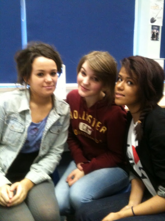
The Group
Group Photo

Sophie Dixon, Emily Moore and Melodie Abraham
Production Company 'Bricloage'
Sunday, 13 February 2011
SD- Titles and Credits
Titles and credits mainly appear in white text on a black background to signify seriousness of Horror genre although their are many others that dont and tend to use Bold red text to signify blood also many horrors have the titles intergrated into the opening scenes with the shopts in the background and titles obviously in the foreground. Jennifers body is a counterpart of the majority of preferred reading having the title in a pink swirly font more like a chick flick or romantic comedy although the pink font could signify a final girl (polysemic.) Although usually the characteristics are endlessly recycled although this doesnt seem to be entirly the case for titles and credits. Halloween uses a bold orange font which could provide a reading of a comical genre although the shots in the background provide anchorage that is is a horror such as a pumpkin carved into a wierd/scary face.
Subscribe to:
Post Comments (Atom)

No comments:
Post a Comment